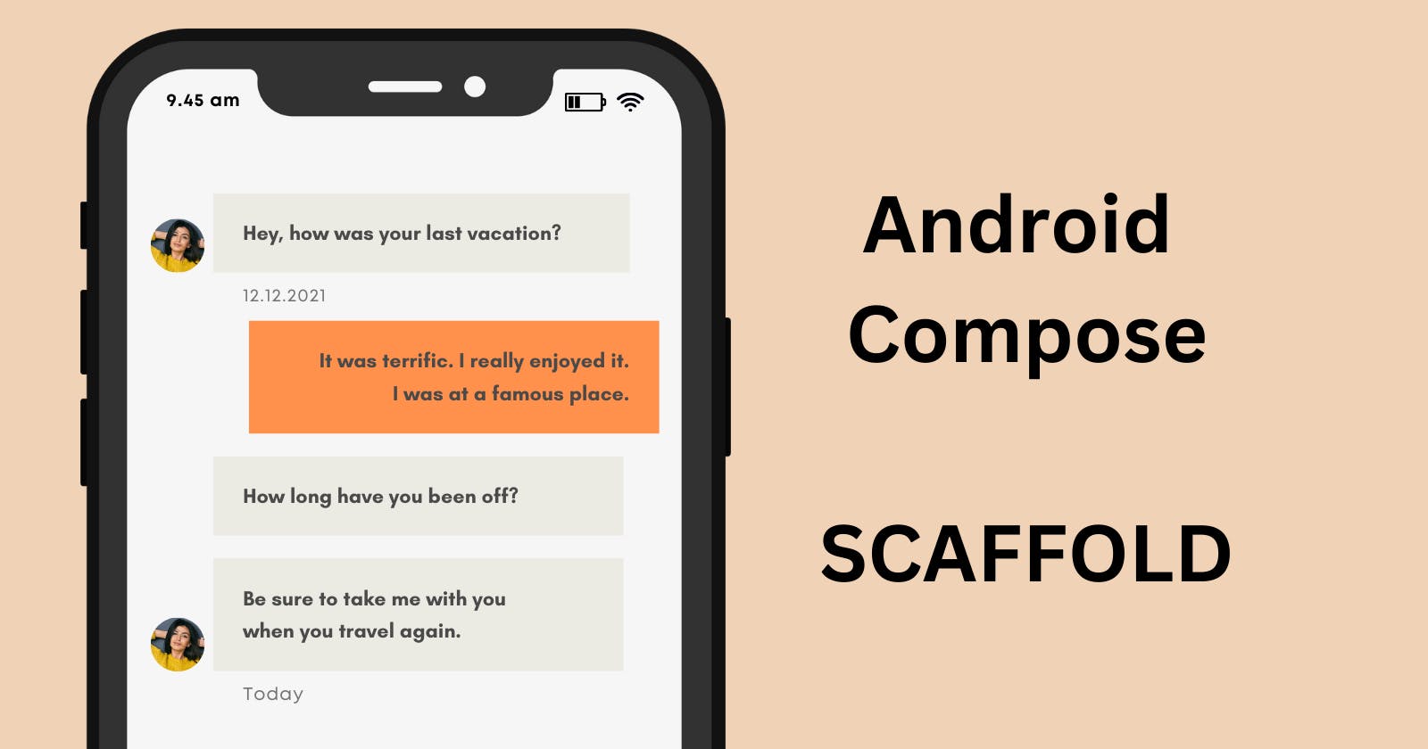
Example of Android Scaffold Structure in Android Compose API


5 min read
Scaffolding originates from construction, referring to a temporary framework of metal poles and wooden planks that supports workers and materials at height. It's crucial for safely constructing, repairing, and maintaining buildings, bridges, and other structures. In programming, however, it means quickly setting up a structure that supports the rest of your code.
The concept of scaffolding was first introduced in Ruby on Rails, where a command could generate a significant amount of useful code.
In the Android Compose API, Scaffold represents the basic structure that displays the page, with all other UI components integrated within this framework.
Example Scaffold Structure
@Composable
fun ScaffoldExample() {
    var presses by remember { mutableIntStateOf(0) }

    Scaffold(
        topBar = {
            TopAppBar(
                colors = topAppBarColors(
                    containerColor = MaterialTheme.colorScheme.primaryContainer,
                    titleContentColor = MaterialTheme.colorScheme.primary,
                ),
                title = {
                    Text("Top app bar")
                }
            )
        },
        bottomBar = {
            BottomAppBar(
                containerColor = MaterialTheme.colorScheme.primaryContainer,
                contentColor = MaterialTheme.colorScheme.primary,
            ) {
                Text(
                    modifier = Modifier
                        .fillMaxWidth(),
                    textAlign = TextAlign.Center,
                    text = "Bottom app bar",
                )
            }
        },
        floatingActionButton = {
            FloatingActionButton(onClick = { presses++ }) {
                Icon(Icons.Default.Add, contentDescription = "Add")
            }
        }
    ) { innerPadding ->
        Column(
            modifier = Modifier
                .padding(innerPadding),
            verticalArrangement = Arrangement.spacedBy(16.dp),
        ) {
            Text(
                modifier = Modifier.padding(8.dp),
                text =
                """
                    This is an example of a scaffold. It uses the Scaffold composable's parameters to create a screen with a simple top app bar, bottom app bar, and floating action button.

                    It also contains some basic inner content, such as this text.

                    You have pressed the floating action button $presses times.
                """.trimIndent(),
            )
        }
    }
}
The code defines a composable function named ScaffoldExample(). Composable functions are the basic building blocks in Jetpack Compose for designing your UI. This function leverages the power of the Scaffold composable to provide a common structure for an app screen, following Material Design guidelines.
Scaffold
The Scaffold composable gives you a fundamental layout template. It serves as a container for the core components of a typical Material Design app:
topBar: This section houses the top app bar, offering a title and space for actions.
bottomBar: A bottom app bar, commonly used for navigation or secondary actions.
floatingActionButton: The iconic Floating Action Button (FAB), used for a primary action in the screen.
content: The central area of your screen where your main UI elements will reside.
Example Code Breakdown
State Management:
var presses by remember { mutableIntStateOf(0) }Initializes a variable namedpressesto track how many times the FAB has been pressed. Therememberblock andmutableIntStateOfensure that the value persists across UI recompositions.
Top App Bar:
The
TopAppBarcomposable customizes the look of the top app bar.colors = topAppBarColors(...): Sets the background (containerColor) and text color (titleContentColor) to align with your app's Material Design theme.
Bottom App Bar:
Similar to the top app bar,
BottomAppBaris used for the bottom section.Its colors are also derived from your
MaterialTheme.A simple
Textelement displays the words "Bottom app bar" horizontally centered.
Floating Action Button:
The
FloatingActionButtoncontains anIcon(the add icon)onClick = { presses++ }: When the FAB is clicked, thepressescounter is incremented.
Content:
The
Scaffold'scontentlambda receivesinnerPadding. This provides default padding values based on Material Design specifications.A
Columnis used to arrange content elements vertically, with some spacing between them.The
Textcomposable displays:A descriptive message about the scaffold example.
The dynamic counter showing how many times the FAB has been pressed.
In Summary
This code shows how the Scaffold composable simplifies making a typical Android app layout. It features app bars, a floating action button, and a main content area, all following Material Design guidelines. The use of the presses variable for state management demonstrates how to create an interactive UI in Jetpack Compose.