Introduction to Adaptive Android Apps
2 min read

Android ecosystem has grown immensely in last few years. Android is not anymore just a smartphone OS but is also worlds most deployed operating system. Adaptive android apps are apps that are designed to work on multiple form factors while making best use of the the device features. This may include phones, tablets, tvs and wearables.
Form factors to be aware of
Android has many form factors but some prominent ones to keep in mind are
Smartphones
Wearables
Tablets
Laptops
Televisions
Dual screen phones
Adaptability
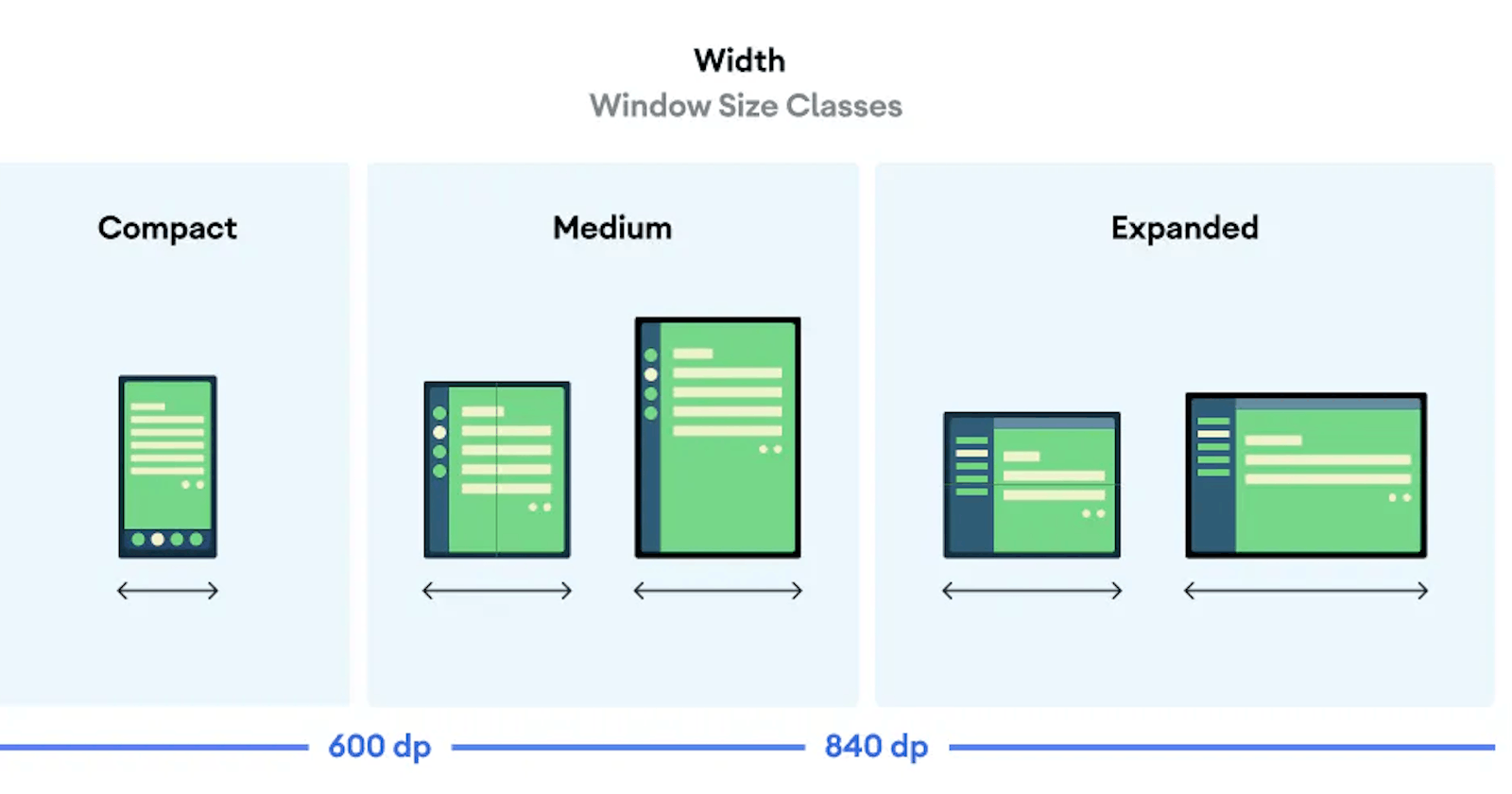
The UI for your app should be responsive to account for different screen sizes, orientations and form factors. An adaptive layout changes based on the screen space available to it. These changes range from simple layout adjustments to fill up space, choosing respective navigation styles, to changing layouts completely to make use of additional room. Adaptive design principles are here for you to understand more deeply. ↗
Make apps adaptable
The process of making apps adaptable using Android's compose API boils down to a very simple idea. Build different UI for different window sizes. The compose API makes is extremely simple. Without compose you will have to use XML based layouts and multiple layouts.

Example code
@Preview(showBackground = true)
@Composable
fun ReplyAppPreview() {
   ReplyTheme {
       ReplyApp(
           replyHomeUIState = ReplyHomeUIState(emails = LocalEmailsDataProvider.allEmails),
           windowSize = WindowWidthSizeClass.Compact
       )
   }
}

@Preview(showBackground = true, widthDp = 700)
@Composable
fun ReplyAppPreviewTablet() {
   ReplyTheme {
       ReplyApp(
           replyHomeUIState = ReplyHomeUIState(emails = LocalEmailsDataProvider.allEmails),
           windowSize = WindowWidthSizeClass.Medium
       )
   }
}

@Preview(showBackground = true, widthDp = 1000)
@Composable
fun ReplyAppPreviewDesktop() {
   ReplyTheme {
       ReplyApp(
           replyHomeUIState = ReplyHomeUIState(emails = LocalEmailsDataProvider.allEmails),
           windowSize = WindowWidthSizeClass.Expanded
       )
   }
}
Conclusion
Adaptive android apps is a design trend that is going to stay and it is important that every developer learns the basic principles of this design trend. It ensures your apps look good across different form factors that the Android OS is popular on and give your users a good delightful experience.